Note
Access to this page requires authorization. You can try signing in or changing directories.
Access to this page requires authorization. You can try changing directories.
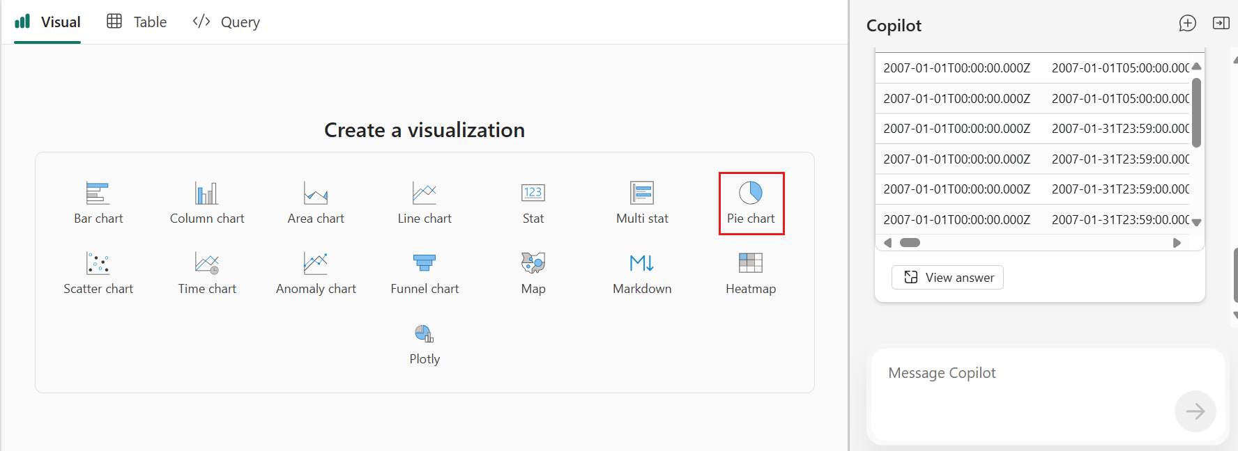
With Copilot, you can preview, explore, and visualize data in Kusto Query Language (KQL) tables in the Real-time Hub.
Access Copilot
There are three ways to access the Explore data option for KQL tables in the Real-time Hub.
Explore data-in-motion tile
- Select the Explore data-in-motion tile.
- Filter by the tables data type.
- Select a KQL table, and then select Choose.

List of Recent streaming data
- In the list of Recent streaming data, filter by the tables data type.
- From a KQL table's context menu (three dots), select Explore data.

KQL table details
- Open the KQL table details.
- Select Explore data from the upper tool bar.

Explore data with Copilot
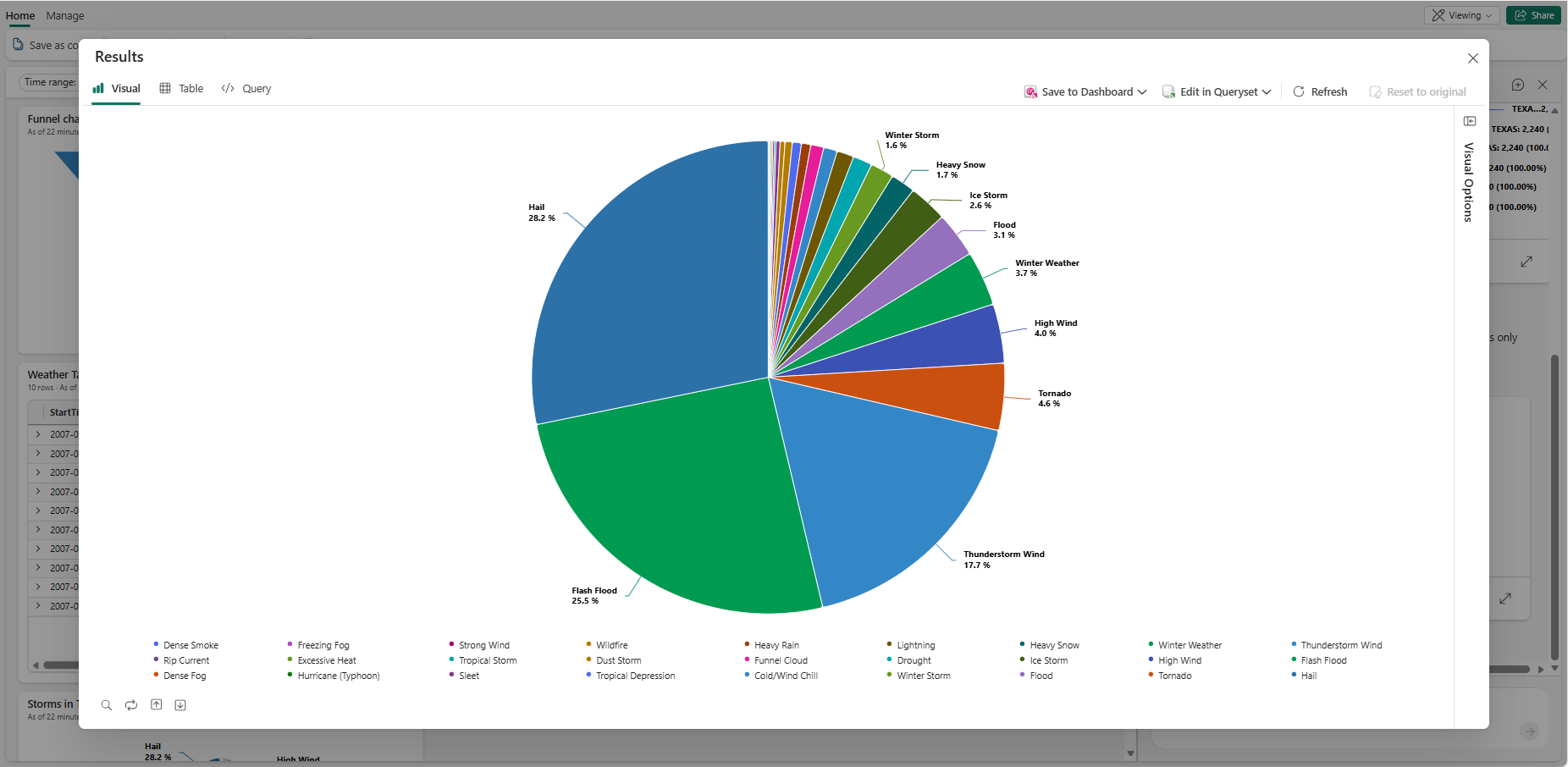
Ask a question about the data. For example, "What are the top 5 event types?" or "Which state had the most events?".
Continue exploring and drilling through the data by asking follow-up questions or making more requests.
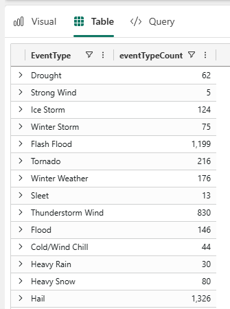
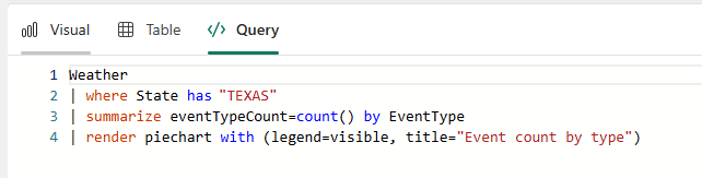
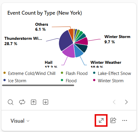
The filtered data appears in the Copilot pane. Select the expand icon to see the results reflected in the Visual, Table, and Query tabs.
Continue exploring and drilling through the data by asking more questions or modifying the visual manually using the Visual Options pane. For more information on customizing the visual, see Customize Real-Time Dashboard visuals.
When you're ready to save your insights to the dashboard, select Save to dashboard. This action saves the current view and query as a new tile on the dashboard. Optionally, you can save the tile to a different existing dashboard or create a new dashboard for the tile. Each saved tile stays connected to your live data, so as the data updates, your visual does too.