Hinweis
Für den Zugriff auf diese Seite ist eine Autorisierung erforderlich. Sie können versuchen, sich anzumelden oder das Verzeichnis zu wechseln.
Für den Zugriff auf diese Seite ist eine Autorisierung erforderlich. Sie können versuchen, das Verzeichnis zu wechseln.
Grundlegendes zur Struktur des Websitedesignspeichers
Die Designfeatures für SharePoint-Websites verwenden ein JSON-Schema, um Farbeinstellungen und andere Informationen zu den einzelnen Designs zu speichern. Designeinstellungen werden in einem JSON-Objekt gespeichert, das die folgenden Schlüssel enthält. Nur das neue Designformat unterstützt die Felder secondaryColor und displayMode:
- isInverted: Dieser Wert sollte für helle Designs auf „false“ und für dunkle Designs auf „true“ gesetzt werden. Er steuert, ob SharePoint dunkle oder helle Designfarben für das Rendern von Text auf farbigem Hintergrund verwendet.
- backgroundImageUril: Der URI eines optionalen Hintergrundbildes für das Design. (Der Wert darf leer sein, wenn kein Hintergrundbild gewünscht ist.)
-
palette: Ein geschachteltes JSON-Objekt, das die RGB-Farbwerte für das Design speichert.
Bei Verwendung des neuen Designformats werden die Werte von
themePrimaryundbackgroundColorals erstes Farbpaar in der Palette verwendet. Das Palettenobjekt enthält die folgenden Schlüssel:- themePrimary
- themeLighterAlt
- themeLighter
- themeLight
- themeTertiary
- themeSecondary
- themeDarkAlt
- themeDark
- themeDarker
- neutralLighterAlt
- neutralLighter
- neutralLight
- neutralQuaternaryAlt
- neutralQuaternary
- neutralTertiaryAlt
- neutralTertiary
- neutralSecondaryAlt
- neutralSecondary
- neutralPrimaryAlt
- neutralPrimary
- neutralDark
- black
- white
- primaryBackground
- primaryText
- bodyBackground
- bodyText
- disabledBackground
- disabledText
- error
- accent
- Backgroundcolor
Hinweis
backgroundColor ist nur im neuen Designformat verfügbar.
Die Farben im Element palette werden als hexadezimale RGB-Zeichenfolgenwerte mit 6 oder 3 Ziffern angegeben.
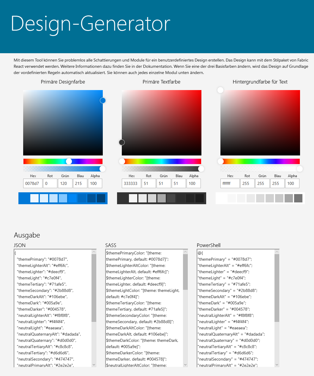
Eine weitere Möglichkeit besteht darin, das Design-Generator-Tool zum Erstellen einer benutzerdefinierten Designpalette zu verwenden. Dieses stellt eine interaktive Benutzeroberfläche zum Auswählen von Designfarben bereit und generiert automatisch die JSON-, SASS- und PowerShell-Definitionen für Ihr benutzerdefiniertes Design:
Hinweis
Die Designgeneratordefinitionen enthalten derzeit nicht die folgenden Farbslots und Schlüssel-Wert-Paare:
- "primaryBackground"
- "primaryText"
- "bodyBackground"
- "bodyText"
- "disabledBackground"
- "disabledText"
- "error"
- "Akzent"
- "backgroundColor"
Diese können vor dem Hochladen auf den Mandanten manuell zu Ihrer generierten Definition hinzugefügt werden.
- secondaryColors: Ein optionaler Abschnitt, der nur im neuen Designformat des SharePoint-Websitedesignschemas verfügbar ist. Es definiert zusätzliche Akzent- und Hintergrundfarbpaare, die die Hauptdesignpalette ergänzen. Das erste Farbpaar stammt aus der Palette. Derzeit wird nur das Design des hellen Modus unterstützt.
Hier ist ein Beispiel für secondaryColors, es ist die Kombination aus themePrimary und backgroundColor. Die Farben im Element secondaryColors werden als hexadezimale RGB-Zeichenfolgenwerte mit 6 oder 3 Ziffern angegeben.
  "secondaryColors": {
    "light": [
      { "themePrimary": "#FFFFFF", "backgroundColor": "#03787C" },
      { "themePrimary": "#E3FFFD", "backgroundColor": "#03787C" },
      { "themePrimary": "#03787C", "backgroundColor": "#E3FFFD" },
      { "themePrimary": "#FFF9E3", "backgroundColor": "#03787C" },
      { "themePrimary": "#03787C", "backgroundColor": "#FFF9E3" },
      { "themePrimary": "#03787C", "backgroundColor": "#F5F5F5" },
      { "themePrimary": "#242424", "backgroundColor": "#F5F5F5" },
      { "themePrimary": "#155473", "backgroundColor": "#FFFFFF" },
      { "themePrimary": "#FFFFFF", "backgroundColor": "#155473" },
      { "themePrimary": "#155473", "backgroundColor": "#E3FFFD" },
      { "themePrimary": "#E3FFFD", "backgroundColor": "#155473" },
      { "themePrimary": "#FFF9E3", "backgroundColor": "#155473" },
      { "themePrimary": "#155473", "backgroundColor": "#FFF9E3" }
    ],
    "dark": []
  }
-
displayMode: Der visuelle Modus, dem die Designpalette entspricht. Derzeit wird nur
lightder Modus unterstützt. -
themeSchemaVersion: Die Designschemaversion. Verwenden Sie
2.0.0für das neueste Designformat. Verwenden Sie1.0.0für das Legacydesignformat. -
version: Die Designversion. Verwenden Sie
2.0.0für das neueste Designformat. Verwenden Sie1.0.0für das Legacydesignformat.
Es folgt ein Beispiel für ein JSON-Objekt, das ein Design im neuen Designformat für das Design Teal definiert.
{
  "isInverted": true,
  "palette": {
    "themeDarker": "#014446",
    "themeDark": "#025C5F",
    "themeDarkAlt": "#026D70",
    "themePrimary": "#03787C",
    "themeSecondary": "#13898D",
    "themeTertiary": "#49AEB1",
    "themeLight": "#98D6D8",
    "themeLighter": "#C5E9EA",
    "themeLighterAlt": "#F0F9FA",
    "neutralDark": "#201F1E",
    "neutralPrimary": "#323130",
    "neutralPrimaryAlt": "#3B3A39",
    "neutralSecondary": "#605E5C",
    "neutralTertiary": "#A19F9D",
    "neutralTertiaryAlt": "#C8C8C8",
    "neutralLight": "#EAEAEA",
    "neutralLighter": "#F4F4F4",
    "neutralLighterAlt": "#F8F8F8",
    "neutralQuaternaryAlt": "#DADADA",
    "neutralQuaternary": "#D0D0D0",
    "black": "#000000",
    "white": "#FFFFFF",
    "backgroundColor": "#FFFFFF"
  },
  "secondaryColors": {
    "light": [
      { "themePrimary": "#FFFFFF", "backgroundColor": "#03787C" },
      { "themePrimary": "#E3FFFD", "backgroundColor": "#03787C" },
      { "themePrimary": "#03787C", "backgroundColor": "#E3FFFD" },
      { "themePrimary": "#FFF9E3", "backgroundColor": "#03787C" },
      { "themePrimary": "#03787C", "backgroundColor": "#FFF9E3" },
      { "themePrimary": "#03787C", "backgroundColor": "#F5F5F5" },
      { "themePrimary": "#242424", "backgroundColor": "#F5F5F5" },
      { "themePrimary": "#155473", "backgroundColor": "#FFFFFF" },
      { "themePrimary": "#FFFFFF", "backgroundColor": "#155473" },
      { "themePrimary": "#155473", "backgroundColor": "#E3FFFD" },
      { "themePrimary": "#E3FFFD", "backgroundColor": "#155473" },
      { "themePrimary": "#FFF9E3", "backgroundColor": "#155473" },
      { "themePrimary": "#155473", "backgroundColor": "#FFF9E3" }
    ],
    "dark": []
  },
  "displayMode": "light",
  "themeSchemaVersion": "2.0.0",
  "version": "2.0.0"
}
Es folgt ein Beispiel für ein JSON-Objekt, das ein Design im Legacydesignformat definiert.
{
  "isInverted": true,
  "palette": {
    "themeDarker": "#014446",
    "themeDark": "#025C5F",
    "themeDarkAlt": "#026D70",
    "themePrimary": "#03787C",
    "themeSecondary": "#13898D",
    "themeTertiary": "#49AEB1",
    "themeLight": "#98D6D8",
    "themeLighter": "#C5E9EA",
    "themeLighterAlt": "#F0F9FA",
    "neutralDark": "#201F1E",
    "neutralPrimary": "#323130",
    "neutralPrimaryAlt": "#3B3A39",
    "neutralSecondary": "#605E5C",
    "neutralTertiary": "#A19F9D",
    "neutralTertiaryAlt": "#C8C8C8",
    "neutralLight": "#EAEAEA",
    "neutralLighter": "#F4F4F4",
    "neutralLighterAlt": "#F8F8F8",
    "neutralQuaternaryAlt": "#DADADA",
    "neutralQuaternary": "#D0D0D0",
    "black": "#000000",
    "white": "#FFFFFF"
  },
  "themeSchemaVersion": "1.0.0",
  "version": "1.0.0"
}
Hinzufügen oder Aktualisieren eines Designs
Verwenden Sie zum Erstellen oder Aktualisieren eines Designs ein vereinfachtes JSON-Format anstelle des vollständigen Designspeicherschemas.
SharePoint-Framework bietet zehn integrierte Designs – acht für helle Hintergründe und zwei für dunkle Hintergründe. Um ein benutzerdefiniertes Design zu erstellen, wählen Sie zunächst eines dieser integrierten Designs aus, und passen Sie die Werte nach Bedarf an. Verwenden Sie dann das PowerShell-Cmdlet Add-SPOTheme , um Ihr benutzerdefiniertes Design mit diesem vereinfachten Format zu erstellen oder zu aktualisieren.
Blaugrünes Design
Verwenden Sie die folgende PowerShell-Hashtabelle, um die Farbpaare für das Teal-Design zu definieren.
$colorPairs = @{
  light = @(
    @{ "accentColor" = "#03787C"; "backgroundColor" = "#FFFFFF" }
    @{ "accentColor" = "#FFFFFF"; "backgroundColor" = "#03787C" }
    @{ "accentColor" = "#E3FFFD"; "backgroundColor" = "#03787C" }
    @{ "accentColor" = "#03787C"; "backgroundColor" = "#E3FFFD" }
    @{ "accentColor" = "#FFF9E3"; "backgroundColor" = "#03787C" }
    @{ "accentColor" = "#03787C"; "backgroundColor" = "#FFF9E3" }
    @{ "accentColor" = "#03787C"; "backgroundColor" = "#F5F5F5" }
    @{ "accentColor" = "#242424"; "backgroundColor" = "#F5F5F5" }
    @{ "accentColor" = "#155473"; "backgroundColor" = "#FFFFFF" }
    @{ "accentColor" = "#FFFFFF"; "backgroundColor" = "#155473" }
    @{ "accentColor" = "#155473"; "backgroundColor" = "#E3FFFD" }
    @{ "accentColor" = "#E3FFFD"; "backgroundColor" = "#155473" }
    @{ "accentColor" = "#FFF9E3"; "backgroundColor" = "#155473" }
    @{ "accentColor" = "#155473"; "backgroundColor" = "#FFF9E3" }
  )
}
Blaues Design
Verwenden Sie die folgende PowerShell-Hashtabelle, um die Farbpaare für das Blau-Design zu definieren.
$colorPairs = @{
  light = @(
    @{ "accentColor" = "#1267B5"; "backgroundColor" = "#FFFFFF" }
    @{ "accentColor" = "#FFFFFF"; "backgroundColor" = "#1267B5" }
    @{ "accentColor" = "#1267B5"; "backgroundColor" = "#D7EEFF" }
    @{ "accentColor" = "#D7EEFF"; "backgroundColor" = "#1267B5" }
    @{ "accentColor" = "#1267B5"; "backgroundColor" = "#B6FEC3" }
    @{ "accentColor" = "#B6FEC3"; "backgroundColor" = "#1267B5" }
    @{ "accentColor" = "#1267B5"; "backgroundColor" = "#EBEBEB" }
    @{ "accentColor" = "#242424"; "backgroundColor" = "#EBEBEB" }
    @{ "accentColor" = "#010B2F"; "backgroundColor" = "#FFFFFF" }
    @{ "accentColor" = "#FFFFFF"; "backgroundColor" = "#010B2F" }
    @{ "accentColor" = "#010B2F"; "backgroundColor" = "#D7EEFF" }
    @{ "accentColor" = "#D7EEFF"; "backgroundColor" = "#010B2F" }
    @{ "accentColor" = "#010B2F"; "backgroundColor" = "#B6FEC3" }
    @{ "accentColor" = "#B6FEC3"; "backgroundColor" = "#010B2F" }
  )
}
Orangefarbenes Design
Verwenden Sie die folgende PowerShell-Hashtabelle, um die Farbpaare für das Design Orange zu definieren.
$colorPairs = @{
  light = @(
    @{ "accentColor" = "#A74411"; "backgroundColor" = "#FFFFFF" }
    @{ "accentColor" = "#FFFFFF"; "backgroundColor" = "#A74411" }
    @{ "accentColor" = "#A74411"; "backgroundColor" = "#D7EEFF" }
    @{ "accentColor" = "#D7EEFF"; "backgroundColor" = "#A74411" }
    @{ "accentColor" = "#A74411"; "backgroundColor" = "#FFECB6" }
    @{ "accentColor" = "#FFECB6"; "backgroundColor" = "#A74411" }
    @{ "accentColor" = "#FF9557"; "backgroundColor" = "#242424" }
    @{ "accentColor" = "#A74411"; "backgroundColor" = "#EBEBEB" }
    @{ "accentColor" = "#242424"; "backgroundColor" = "#EBEBEB" }
  )
}
Rotes Design
Verwenden Sie die folgende PowerShell-Hashtabelle, um die Farbpaare für das Rot-Design zu definieren.
$colorPairs = @{
  light = @(
    @{ "accentColor" = "#AD3A39"; "backgroundColor" = "#FFFFFF" }
    @{ "accentColor" = "#FFFFFF"; "backgroundColor" = "#AD3A39" }
    @{ "accentColor" = "#AD3A39"; "backgroundColor" = "#FFE0E2" }
    @{ "accentColor" = "#FFE0E2"; "backgroundColor" = "#AD3A39" }
    @{ "accentColor" = "#AD3A39"; "backgroundColor" = "#FFECB6" }
    @{ "accentColor" = "#FFECB6"; "backgroundColor" = "#AD3A39" }
    @{ "accentColor" = "#AD3A39"; "backgroundColor" = "#EBEBEB" }
    @{ "accentColor" = "#242424"; "backgroundColor" = "#EBEBEB" }
    @{ "accentColor" = "#590408"; "backgroundColor" = "#FFFFFF" }
    @{ "accentColor" = "#FFFFFF"; "backgroundColor" = "#590408" }
    @{ "accentColor" = "#590408"; "backgroundColor" = "#FFE0E2" }
    @{ "accentColor" = "#FFE0E2"; "backgroundColor" = "#590408" }
    @{ "accentColor" = "#590408"; "backgroundColor" = "#FFECB6" }
    @{ "accentColor" = "#FFECB6"; "backgroundColor" = "#590408" }
  )
}
Lilafarbenes Design
Verwenden Sie die folgende PowerShell-Hashtabelle, um die Farbpaare für das Lila-Design zu definieren.
$colorPairs = @{
  light = @(
    @{ "accentColor" = "#72559B"; "backgroundColor" = "#FFFFFF" }
    @{ "accentColor" = "#FFFFFF"; "backgroundColor" = "#72559B" }
    @{ "accentColor" = "#72559B"; "backgroundColor" = "#EEE2FF" }
    @{ "accentColor" = "#EEE2FF"; "backgroundColor" = "#72559B" }
    @{ "accentColor" = "#72559B"; "backgroundColor" = "#FFECB6" }
    @{ "accentColor" = "#FFECB6"; "backgroundColor" = "#72559B" }
    @{ "accentColor" = "#72559B"; "backgroundColor" = "#EBEBEB" }
    @{ "accentColor" = "#242424"; "backgroundColor" = "#EBEBEB" }
    @{ "accentColor" = "#382D6F"; "backgroundColor" = "#FFFFFF" }
    @{ "accentColor" = "#FFFFFF"; "backgroundColor" = "#382D6F" }
    @{ "accentColor" = "#382D6F"; "backgroundColor" = "#EEE2FF" }
    @{ "accentColor" = "#EEE2FF"; "backgroundColor" = "#382D6F" }
    @{ "accentColor" = "#382D6F"; "backgroundColor" = "#FFECB6" }
    @{ "accentColor" = "#FFECB6"; "backgroundColor" = "#382D6F" }
  )
}
Grünes Design
Verwenden Sie die folgende PowerShell-Hashtabelle, um die Farbpaare für das Design Grün zu definieren.
$colorPairs = @{
  light = @(
    @{ "accentColor" = "#437509"; "backgroundColor" = "#FFFFFF" }
    @{ "accentColor" = "#FFFFFF"; "backgroundColor" = "#437509" }
    @{ "accentColor" = "#437509"; "backgroundColor" = "#C2FFFC" }
    @{ "accentColor" = "#C2FFFC"; "backgroundColor" = "#437509" }
    @{ "accentColor" = "#437509"; "backgroundColor" = "#CCFF4D" }
    @{ "accentColor" = "#CCFF4D"; "backgroundColor" = "#437509" }
    @{ "accentColor" = "#437509"; "backgroundColor" = "#F5F5F5" }
    @{ "accentColor" = "#242424"; "backgroundColor" = "#F5F5F5" }
    @{ "accentColor" = "#2C5A43"; "backgroundColor" = "#FFFFFF" }
    @{ "accentColor" = "#FFFFFF"; "backgroundColor" = "#2C5A43" }
    @{ "accentColor" = "#2C5A43"; "backgroundColor" = "#C2FFFC" }
    @{ "accentColor" = "#C2FFFC"; "backgroundColor" = "#2C5A43" }
    @{ "accentColor" = "#2C5A43"; "backgroundColor" = "#CCFF4D" }
    @{ "accentColor" = "#CCFF4D"; "backgroundColor" = "#2C5A43" }
  )
}
Periwinkle-Design
Verwenden Sie die folgende PowerShell-Hashtabelle, um die Farbpaare für das Periwinkle-Design zu definieren.
$colorPairs = @{
  light = @(
    @{ "accentColor" = "#5B5D9B"; "backgroundColor" = "#FFFFFF" }
    @{ "accentColor" = "#FFFFFF"; "backgroundColor" = "#5B5D9B" }
    @{ "accentColor" = "#5B5D9B"; "backgroundColor" = "#DEE2FC" }
    @{ "accentColor" = "#DEE2FC"; "backgroundColor" = "#5B5D9B" }
    @{ "accentColor" = "#5B5D9B"; "backgroundColor" = "#B6FEC3" }
    @{ "accentColor" = "#B6FEC3"; "backgroundColor" = "#5B5D9B" }
    @{ "accentColor" = "#5B5D9B"; "backgroundColor" = "#EBEBEB" }
    @{ "accentColor" = "#242424"; "backgroundColor" = "#EBEBEB" }
    @{ "accentColor" = "#382D6F"; "backgroundColor" = "#FFFFFF" }
    @{ "accentColor" = "#FFFFFF"; "backgroundColor" = "#382D6F" }
    @{ "accentColor" = "#382D6F"; "backgroundColor" = "#DEE2FC" }
    @{ "accentColor" = "#DEE2FC"; "backgroundColor" = "#382D6F" }
    @{ "accentColor" = "#382D6F"; "backgroundColor" = "#B6FEC3" }
    @{ "accentColor" = "#B6FEC3"; "backgroundColor" = "#382D6F" }
  )
}
Cobalt-Design
Verwenden Sie die folgende PowerShell-Hashtabelle, um die Farbpaare für das Cobalt-Design zu definieren.
$colorPairs = @{
  light = @(
    @{ "accentColor" = "#355DCD"; "backgroundColor" = "#FFFFFF" }
    @{ "accentColor" = "#FFFFFF"; "backgroundColor" = "#355DCD" }
    @{ "accentColor" = "#355DCD"; "backgroundColor" = "#D7EEFF" }
    @{ "accentColor" = "#D7EEFF"; "backgroundColor" = "#355DCD" }
    @{ "accentColor" = "#355DCD"; "backgroundColor" = "#B0F4FF" }
    @{ "accentColor" = "#B0F4FF"; "backgroundColor" = "#355DCD" }
    @{ "accentColor" = "#355DCD"; "backgroundColor" = "#EBEBEB" }
    @{ "accentColor" = "#242424"; "backgroundColor" = "#EBEBEB" }
    @{ "accentColor" = "#1A1F50"; "backgroundColor" = "#FFFFFF" }
    @{ "accentColor" = "#FFFFFF"; "backgroundColor" = "#1A1F50" }
    @{ "accentColor" = "#1A1F50"; "backgroundColor" = "#D7EEFF" }
    @{ "accentColor" = "#D7EEFF"; "backgroundColor" = "#1A1F50" }
    @{ "accentColor" = "#1A1F50"; "backgroundColor" = "#B0F4FF" }
    @{ "accentColor" = "#B0F4FF"; "backgroundColor" = "#1A1F50" }
  )
}
Design "Dunkles Teal"
Verwenden Sie die folgende PowerShell-Hashtabelle, um die Farbpaare für das Design Dark Teal zu definieren.
$colorPairs = @{
  light = @(
    @{ "accentColor" = "#51AEB2"; "backgroundColor" = "#292929" }
    @{ "accentColor" = "#FFFFFF"; "backgroundColor" = "#03787C" }
    @{ "accentColor" = "#E3FFFD"; "backgroundColor" = "#03787C" }
    @{ "accentColor" = "#03787C"; "backgroundColor" = "#E3FFFD" }
    @{ "accentColor" = "#FFF9E3"; "backgroundColor" = "#03787C" }
    @{ "accentColor" = "#03787C"; "backgroundColor" = "#FFF9E3" }
    @{ "accentColor" = "#FFF9E3"; "backgroundColor" = "#292929" }
    @{ "accentColor" = "#F5F5F5"; "backgroundColor" = "#292929" }
    @{ "accentColor" = "#E3FFFD"; "backgroundColor" = "#292929" }
    @{ "accentColor" = "#FFFFFF"; "backgroundColor" = "#155473" }
    @{ "accentColor" = "#155473"; "backgroundColor" = "#E3FFFD" }
    @{ "accentColor" = "#E3FFFD"; "backgroundColor" = "#155473" }
    @{ "accentColor" = "#FFF9E3"; "backgroundColor" = "#155473" }
    @{ "accentColor" = "#155473"; "backgroundColor" = "#FFF9E3" }
  )
}
Dunkelblaues Design
Verwenden Sie die folgende PowerShell-Hashtabelle, um die Farbpaare für das Dunkelblau-Design zu definieren.
$colorPairs = @{
  light = @(
    @{ "accentColor" = "#529FF1"; "backgroundColor" = "#292929" }
    @{ "accentColor" = "#FFFFFF"; "backgroundColor" = "#1267B5" }
    @{ "accentColor" = "#1267B5"; "backgroundColor" = "#D7EEFF" }
    @{ "accentColor" = "#D7EEFF"; "backgroundColor" = "#1267B5" }
    @{ "accentColor" = "#1267B5"; "backgroundColor" = "#B6FEC3" }
    @{ "accentColor" = "#B6FEC3"; "backgroundColor" = "#1267B5" }
    @{ "accentColor" = "#B6FEC3"; "backgroundColor" = "#292929" }
    @{ "accentColor" = "#F5F5F5"; "backgroundColor" = "#292929" }
    @{ "accentColor" = "#D7EEFF"; "backgroundColor" = "#292929" }
    @{ "accentColor" = "#FFFFFF"; "backgroundColor" = "#010B2F" }
    @{ "accentColor" = "#010B2F"; "backgroundColor" = "#D7EEFF" }
    @{ "accentColor" = "#D7EEFF"; "backgroundColor" = "#010B2F" }
    @{ "accentColor" = "#010B2F"; "backgroundColor" = "#B6FEC3" }
    @{ "accentColor" = "#B6FEC3"; "backgroundColor" = "#010B2F" }
  )
}